The One About Design Tokens
Published on
A Brief History
In 2014, the web had preprocessors for naming values, methods for naming styles, and mental models for thinking about interfaces as systems. There was still a problem though, everything was platform specific. Sass in Sass, BEM (Block__element--modifier syntax) in CSS — none of it could talk to iOS or Android. Design decisions were made and recreated multiple times, across teams and languages, slowly drifting apart.
Jina Anne was working on the Salesforce Lightning Design System when they noticed the problem and found a solution. That solution was design tokens — named variables that could store a design decision once and distribute them anywhere.
By 2019, enough people felt this friction that the Design Tokens Community Group (DTCG) under W3C began. This brought designers, developers, and tool-makers together to create a shared specification — collectively solving the problem instead of individually. 1
Håkon Wium Lie (a Norwegian web pioneer) proposed separating content from presentation in 1994. Finally, over thirty years later, in October 2025, the DTCG published their first stable version 2 for sharing design decisions across every platform.
The specification describes design tokens as indivisible pieces of a design system such as colours, spacing, and typographic scale.
Applying the Specification
Design Tokens, under the specification, use JSON format due to its simplicity, widespread use and popularity (lower learning curve). Style Dictionary 3 is a build-system that uses this format, which can be used to transform the tokens and then export to any platform (iOS, Android, CSS etc).
Colour
Using too many colours can cause eye fatigue and cognitive overwhelm. Studio1design provides a useful formula for balancing colour palettes. This formula helps create visually appealing, user-friendly websites by strategically distributing colours. 4
| Count | Type | Description |
|---|---|---|
| 1-3 | Main | Dominates 70% of the design, establishing brand identity and consistency. |
| 1 | Pop | Used sparingly to highlight key elements. |
| 1-2 | Neutral | Provides clarity and balance for backgrounds, body text and whitespace. |
I'm using three shades of purple, along with a complementary yellow on two neutral variations, to provide an accessible experience for readers.
The raw values use oklch() notation which is better for colour modifications, human readability, and accessibility, while also supporting p3 colours (30% more human-visible colour on modern devices).
5
Tokens generally follow a three-tier hierarchy system: primitive (raw values), semantic (assign jobs to raw values), and component (specific, tied to elements).
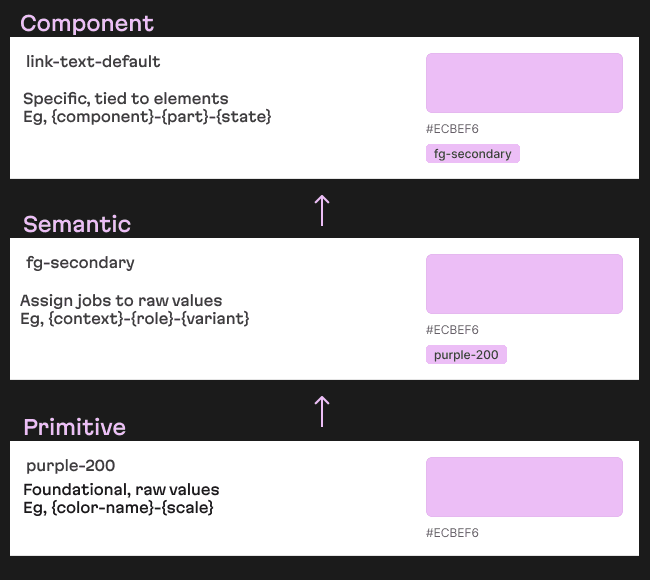
Translating that to the specification requires "$type": "color".
Spacing
Spacing tokens are reserved for paddings, margins, and dimensions (derived from the Box Model). Their primary objective is to establish uniform spacing guidelines and enhance overall visual consistency to promote a cohesive design.
Spacing systems generally follow one of two multipliers, 8 or 4 points.
| Multiplier | Example |
|---|---|
| 8-point | 8px → 16px → 24px → 32px |
| 4-point | 4px → 8px → 12px → 16px |
The reason for these multiples is that most popular screen resolutions are divisible by them on at least one axis.
| Resolution | Is Divisible |
|---|---|
| 360 x 800 (mobile) | ✔ ✔ |
| 768 x 1024 (tablet) | ✔ ✔ |
| 1266 x 768 (HD) | ✘ ✔ |
| 1920 x 1080 (FHD) | ✔ ✔ |
| 2560 x 1440 (QHD) | ✔ ✔ |
| 3840 x 2160 (4K) | ✔ ✔ |
The 8-point system was popularised in 2016 by Bryn Jackson 6; however, in more recent years, the 4-point system seems to be gaining traction for its granularity. 7
Spacing has several naming conventions. 8
| Name | Example |
|---|---|
| Numeric | spacing-100, spacing-200, spacing-300 |
| Multiplier | spacing-x1, spacing-x2, spacing-x3 |
| T-shirt Size | spacing-s, spacing-m, spacing-l |
Numeric is the most popular and preferred method of scaling spacing tokens. Translating that requires the dimension type.
Typography
Evil Martians have developed their own font, which I love. They were my choice in typography — Martian Grotesk 9 and Martian Mono 10, which have a brutalistic and eye-catching aesthetic.
Primitives consist of five key properties: font family, weight, size, line height (line spacing), and letter spacing (tracking).
Line height should be at least 1.5 times the font-size, and letter spacing 0.12 times font size to meet accessibility standards. 11
Semantic typographic tokens are generally organised with hierarchy in mind.
| Name | Description |
|---|---|
| Display | Large, attention-grabbing text for key visuals or standout messaging. |
| Heading | Primary titles that introduce major sections. |
| Subheading | Secondary titles that further break down content. |
| Body | Main text for paragraphs and detailed information. |
| Caption | Smaller text that supports images or supplementary content. |
| Label | Brief descriptors for form fields, buttons, and icons. |
UX Collective recommends a typographic hierarchy for naming conventions 12, such as [Category] / [Size] / [Style] / [Attribute].
| Name | Description |
|---|---|
| Category | Defines the text’s purpose (e.g., Heading). |
| Size | Indicates the type scale (often using t-shirt sizing). |
| Style | Specifies the text styling, such as Regular, Bold, or SemiBold. |
| Attribute | Identifies the typography property being defined, such as weight, size, line height, or letter spacing. |
Translating these fonts required the use of five different types that are outlined in the specification — fontFamily, dimension, fontWeight, number, and typography.
Complete Sample
JSON Input
CSS Output
Closing Thoughts
It would be nice if Figma had native support of the specification to save manual token setup in the design tool,
but I could only find some community plugins — that I couldn't access on the free-tier.
However, they don't support oklch() either, and that has been widely available since May 2023.
There is more to design tokens than colour, spacing, and typography — such as radius, motion, and other visual properties. Overall, it's clear that the specification provides a single source of truth, establishing shared language, and design consistency.
Footnotes
https://david-lewis.com/posts/the-incomplete-history-of-design-tokens/
↩https://www.designtokens.org/tr/2025.10/
↩https://styledictionary.com/
↩https://studio1design.com/how-important-is-color-in-website-design/
↩https://evilmartians.com/chronicles/oklch-in-css-why-quit-rgb-hsl
↩https://spec.fm/specifics/8-pt-grid
↩https://archive.md/ILpBq
↩https://blog.designary.com/p/spacing-systems-and-scales-ui-design
↩https://evilmartians.com/products/martian-grotesk
↩https://evilmartians.com/products/martian-mono
↩https://www.w3.org/WAI/WCAG21/Understanding/text-spacing
↩https://uxdesign.cc/mastering-typography-in-design-systems-with-semantic-tokens-and-responsive-scaling-6ccd598d9f21
↩